ONLY YOUR X SKINCARE
Client: Creative 2 Agency
Developed educational Instagram content focused on skin health, ingredient knowledge, and professional skincare principles. Created carousels, posts, and story sets aligned with a clinical brand tone, translating complex skin science into clear, engaging visuals and copy for a professional audience.
FRESH32
Client: Fresh32 - Concept work
Three story-format social media concepts created as a test assignment, focused on Gen Z communication. The creatives highlight sustainability, playful Gen Z humor and trust-building through clean, bold and platform-native visuals.
PINK PANDA
Client: Licila.si | PINK PANDA
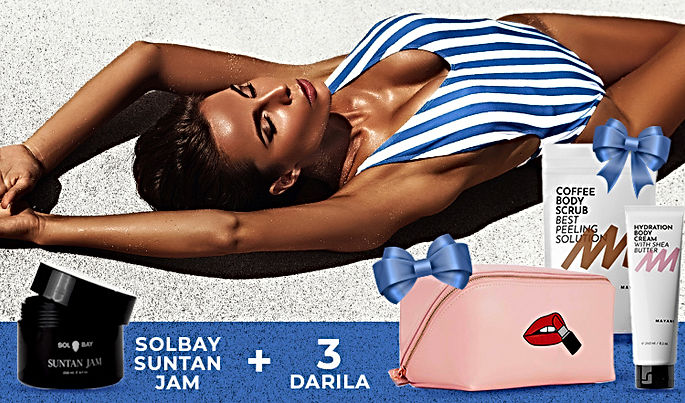
As a graphic designer, I’ve crafted ads, page banners, and mailing banners for top beauty brands like L'Oréal, Garnier, Rimmel, Syoss and other. My work focuses on creating visually compelling designs that align with each brand’s identity, enhancing their digital presence and engaging their target audiences.
These are a few of the static and animated ads and banners.


OLIMP SPORT NUTRITION POSTS
Client: Proteini.si - Test Assignment
Two designs for social media with different approach; the first design highlights key benefits, using a bold, informative approach, the second one is focused on a refreshing and energetic appeal, using dynamic splashes and a "Buy Now!" call-to-action.
CIRKUS FUSKABO
Client: Zavod Skala Don Bosko | Cirkus Fuskabo
I designed a vibrant and engaging brochure for Cirkus Fuskabo, showcasing their 2025–2029 strategic plan. The layout emphasized their mission, programs, and goals, using bold typography and dynamic visuals to reflect the energy of the organization. It also served as a call to action, inviting partnerships and community involvement while highlighting their inspiring, inclusive approach.
LELOSI
Client: Uvecto d.o.o. | LELOSI
In my role as a graphic and textile designer at Lelosi, I passionately contributed to the creative process, specializing in crafting visually captivating designs for leggings, pajamas, and other apparel. Through my innovative approach, I seamlessly blended graphic elements with textile aesthetics, elevating Lelosi's product line and ensuring a distinctive and appealing customer experience.
PAG CITY ONLINE
Client: Pag Tourist Board & 800, vl. Ivan Magaš
In my role developing the application for Pag City Online, I curated a digital experience that seamlessly integrates informative text and captivating visuals to showcase Pag's monumental attractions. This innovative app not only serves as a virtual tour guide, offering users detailed insights into Pag's landmarks through images and text, but also provides essential services akin to Google Maps, enhancing the overall accessibility and navigation for visitors exploring the rich cultural heritage of Pag.
The app is still under construction, but the webpage is available on: https://pag-city.online/
PAG OUTDOORS
Client: Pag Tourist Board
Design & illustration of poster for Pag Tourist Board in cooperation with Pag MareMonti Sports Tourism Association. The poster contains all the dates on which sports tourism activities are carried out. They offer various activities such as biking, kayaking and hiking and nordic walking all around the Pag island.
Poster for year 2023 and 2022.
TETINO IGRIŠČE (AUNT'S PLAYGROUND)
Client: Vrtec Dobra teta (transl. Kindergarten Good aunt)
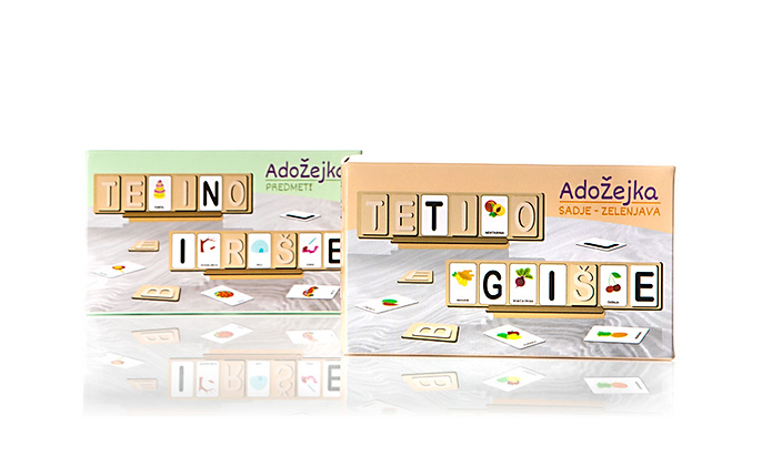
As a dedicated graphic designer for a private kindergarten, my creative expertise extends to curating engaging and educational games tailored for children, fostering a vibrant learning environment. Additionally, I specialize in designing captivating packaging for the kindergarten's products, ensuring a visually appealing and child-friendly presentation that resonates with both parents and young learners.
A comprehensive brochure for the game Adožejka, merging clear instructions with captivating visuals to provide players with an immersive and user-friendly guide, enhancing their experience and ensuring seamless gameplay.
APPLIMENT | GLOBAL PLUS
Client: Global Plus
While working for Appliment, this banner was designed for client Global Plus. They sell moto gear and this was a banner created for their webshop opening.
UP PEF LOGO
Client: Faculty of education, University of Primorska
Logo created for the needs of the project of the Faculty of Education.
The project aimed to encourage students and other faculty staff to actively spend their free time, especially by walking in the hills.
Motive: From the seaside (where the faculty is) to Triglav (which was the final destination of a project)
KUPI DOBRO LOGO
Client: Branislav Čepin s.p
Logo designed for an online shop.
Kupi dobro means "buy good" in translation from slovene language hence the unification of thumbs up sign and a shopping cart.
Motive: Thumbs up sign, shopping cart
KUD SLOGA
Cultural Society "Sloga" deals with wide range of operations from theater and stand up performances, event management, travelogues, photography to film making, exhibitions and workshops for children. They wanted to redesign their logo and combine all of the operations in one presentation symbol.
Motive: Theater, movie, microphone
KUD MEDVEDJE BRDO
Logo created for cultural society. Medvedje Brdo - which translated from slovene language would mean "bear hill".
They are a theater group, that organizes and performs different plays hence the microphone in bear's hand.
Motive: Microphone, bear.
SHAPEBOXING
Client: Tamara Smonker s.p
Redesign of the logo according to the client's wishes.
Designs of several flyers, promotional ads and graphics for a sweater.


